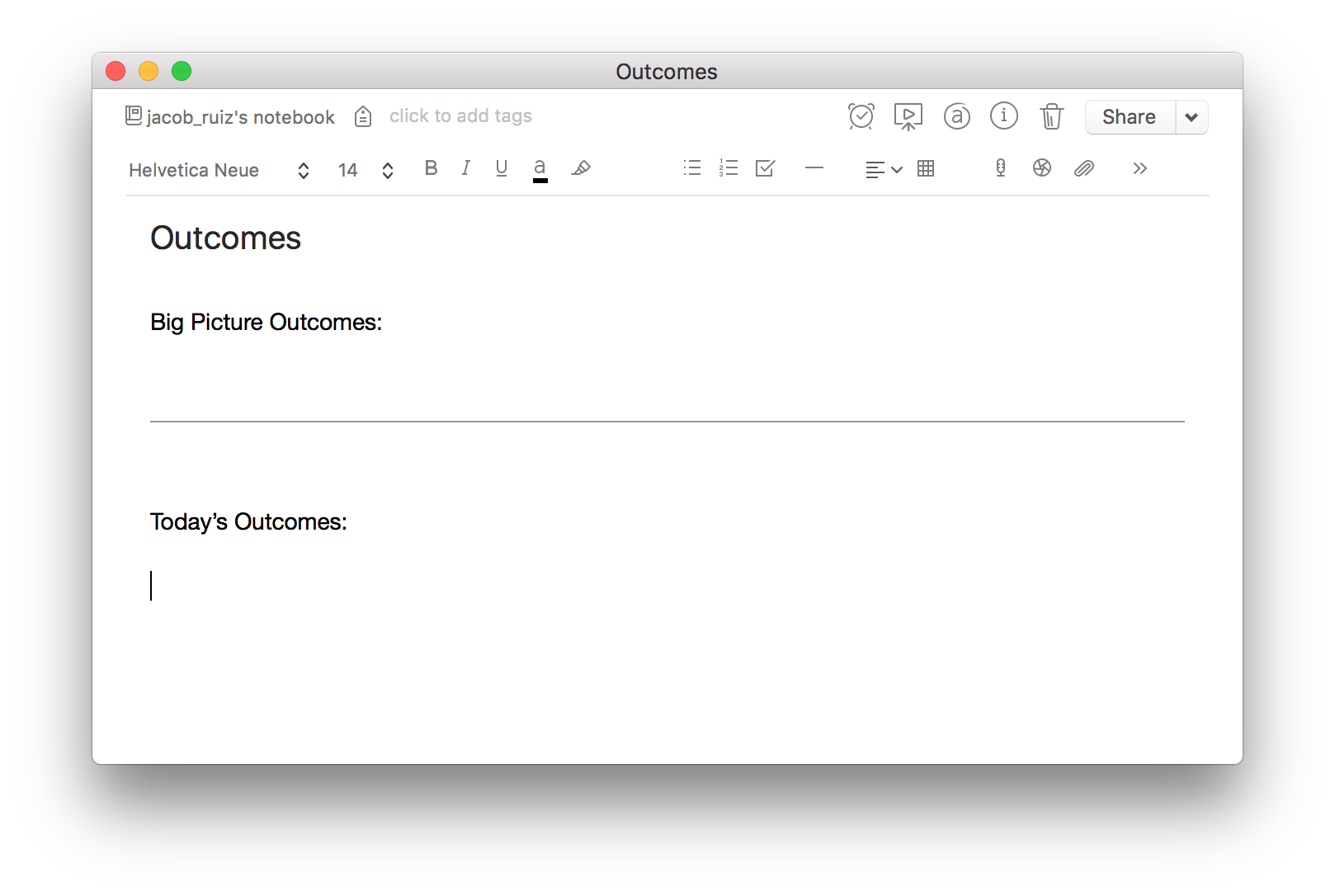
I start each day of work the same way. I sit down and write a document entitled "Outcomes". Here's the format:
Read More
Tutorial: How to use Zeplin to automatically generate measurements, styles, and assets from your Sketch files
Zeplin is the industry-standard for creating specs from Sketch mockups to give to developers. In this quick walkthrough, you'll see how to set up Zeplin to automatically generate precise and easy-to-use specs from your mockups.
Read More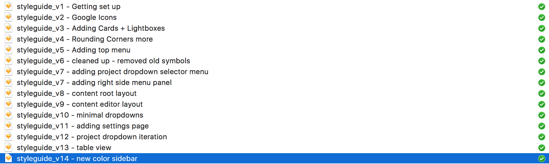
Name your design files like this to track changes and stay sane
Iteration is the name of the game in UI/UX design. We're constantly making incremental improvements to our work, getting feedback, and iterating again. The process isn't totally linear either, we're often reverting back to a previous iteration after an exploration didn't prove to be beneficial.
In order to allow this process to unfold in the most efficient and fluid way, we have to be smart about how we set up our workflow.
One technique I use to track changes and allow for forward and backward iteration is pretty simple, and is very similar to how developers track their changes in git.
Each time I iterate on a given file, I do the following:
- Duplicate the file
- Rename the file like this:
- Increment the version number (Example: "v1" becomes "v2)
- Add a brief description of the changes you're making in this version. (Example: "Change primary button color to blue")
- Open the new file and get to work!
Now, I have a running list of all the changes I've made, making it easy to go back and pull out previous iterations if needed.
This is a really simple and straightforward way of tracking changes at a basic level, and there are other methods to do this in more sophisticated ways. For example, Craft Library is a great tool to push and pull changes at a component level and keep teams in sync.
But if you're just looking for an easy, no-frills way to keep your iterations manageable, I'd highly recommend naming your files in this way.
Tip: If you're working with other designers on the same files, it's helpful to add your initials to the file name, so people can know who made each change.
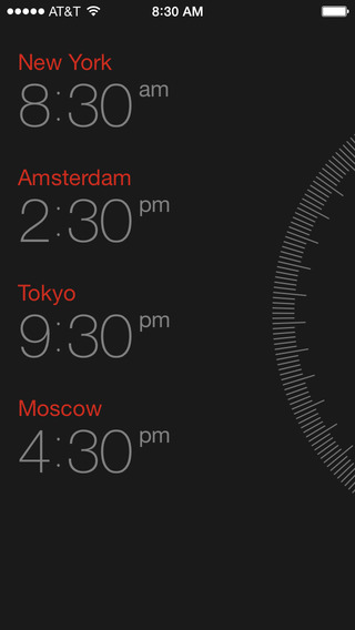
This is the best app for planning client communication across timezones
As a freelance designer you're likely to have clients and collaborators in multiple time zones. Doing the mental math to figure out what time it will be in San Francisco at a given time in, say, Yangon can be a headache and leaves room for error.
Download 'Miranda' on your iPhone or Android and make life easier for yourself. It's the most clever UI I've seen for figuring out meeting times across multiple time zones. I've already mentioned Miranda in a previous post about essential tools for freelance designers but I'm still loving it and felt the need to call it out separately. Get it from the App Store here.
Big kudos to whoever the designer is over at SoftFacade. It's a really clever and simple UI.
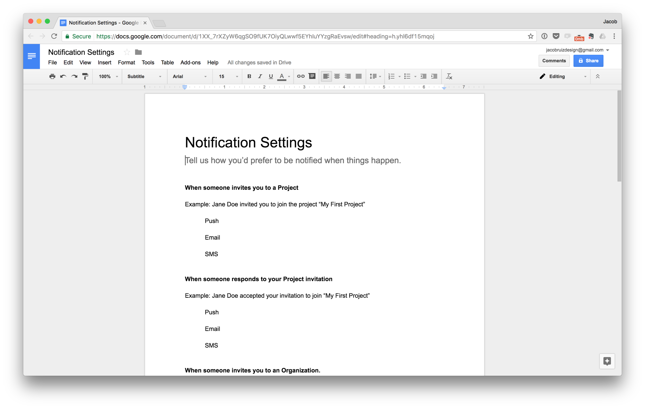
Design Technique: Design in Google Docs to Clarify Your Thinking and Focus on Content
Designers need to constantly fight the urge to get caught up in visual design, and instead focus on content and structure. One technique I'd recommend trying in order to focus on content is designing in Google Docs. It might sound boring and pedestrian, but it's extremely effective in...
Read MoreTutorial: How To Make a Squircle Shape In Sketch (Not a Rounded Rectangle)
WTF is a "Squircle", you ask? It's a shape that's a hybrid between a square and a circle. It's different than a rectangle with rounded corners because with a squircle, the corners taper off gradually into a flat plane, rather than following a perfect circle at the corners.
Apple popularized the squircle when they introduced iOS 7 and ditched rounded rectangles for squircles for all app icons.
Squircles give a friendly and playful feel with their lack of hard edges, and the radius of the corners can be played with to get different effects.
The problem with squircles is that you can't easily make one with common settings in a program like Sketch.
If you'd like to make some squircles of your own,
Read MoreWork In Progress: 75 App Icon iterations in 16 seconds (Video)
I've been making a Mac app as a side project and I needed an app icon. Here are all 75 iterations in one 16 second video. Ultimately I landed on a playful and modern design that uses repeating, overlapped rectangles to give a stacked effect. Excited to share the project once it's finished. Stay tuned!


Any fear-based thought: Identify it and reject it.
Awareness about the nature of your thought patterns is a critical component of general well-being and happiness. Fear is a particularly destructive quality of thought that can get in the way of living a full and fresh life.
One technique I use in conditioning my thought patterns is to monitor for what I call "fear-based thought". For any given thought, ask yourself where this thought came from. If it came from fear (fear of failure, fear of rejection, fear of discomfort, fear of any kind), take note that this is where this thought came from, and dismiss it. Fear-based thought instantly loses credibility and influence in your decision-making when you have identified it as such.
By doing this, it becomes easier to operate with lightness and fearlessness. Self-doubt can be replaced by self-support and adventurousness. You no longer operate from a place of loss-aversion. You're now playing to win, rather than playing not to lose.

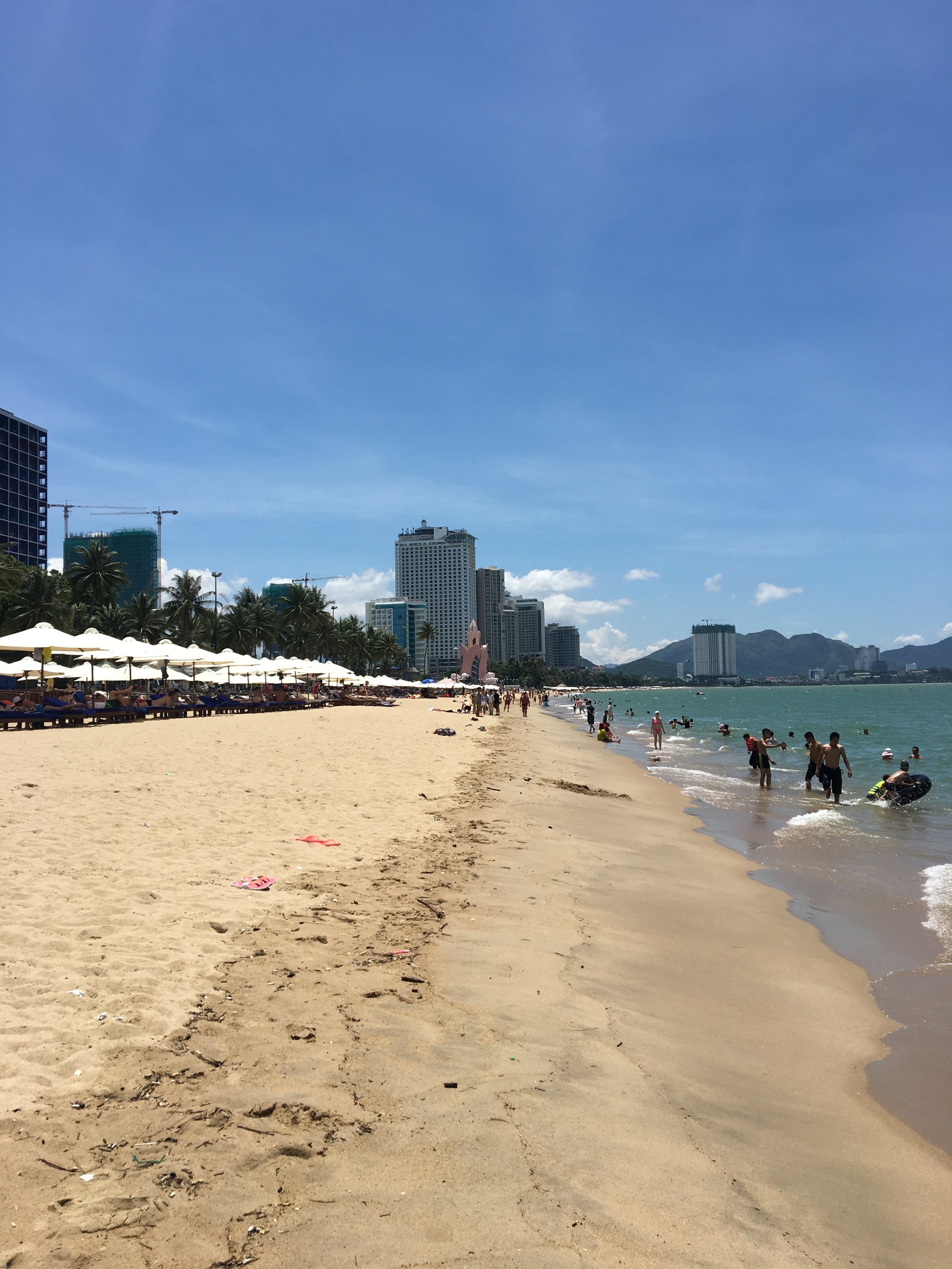
Experimenting with Video Part 3: 30 seconds in Nha Trang
A collection of footage I captured on a single walk down the beach in Nha Trang. Each time I play with video as a format I'm more convinced that shorter cuts are better. Of course, it depends on the mood you're going for, but I love how the cadence of cuts can give a certain rhythm to the visual experience.
An interesting technique is to play with the attention span of the viewer. There's a sweet spot where the viewer has just recognized what the image is, and the longer you dwell on that image, the more the attention starts to fade and your visual becomes stale.
By cutting to a new shot right at the moment where the viewer has barely just perceived what the shot is, you create a really fresh experience where the viewer is constantly engaged.
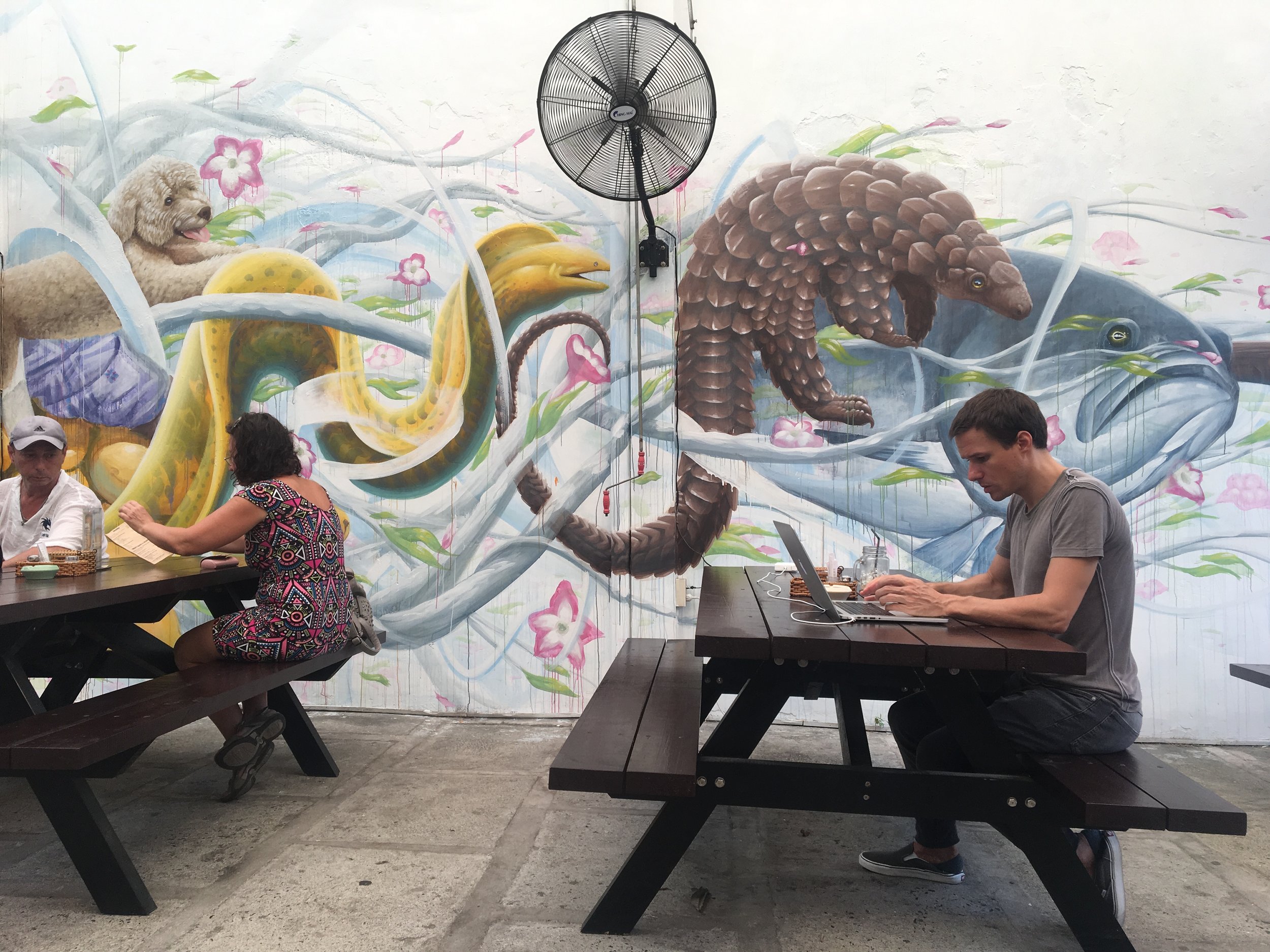
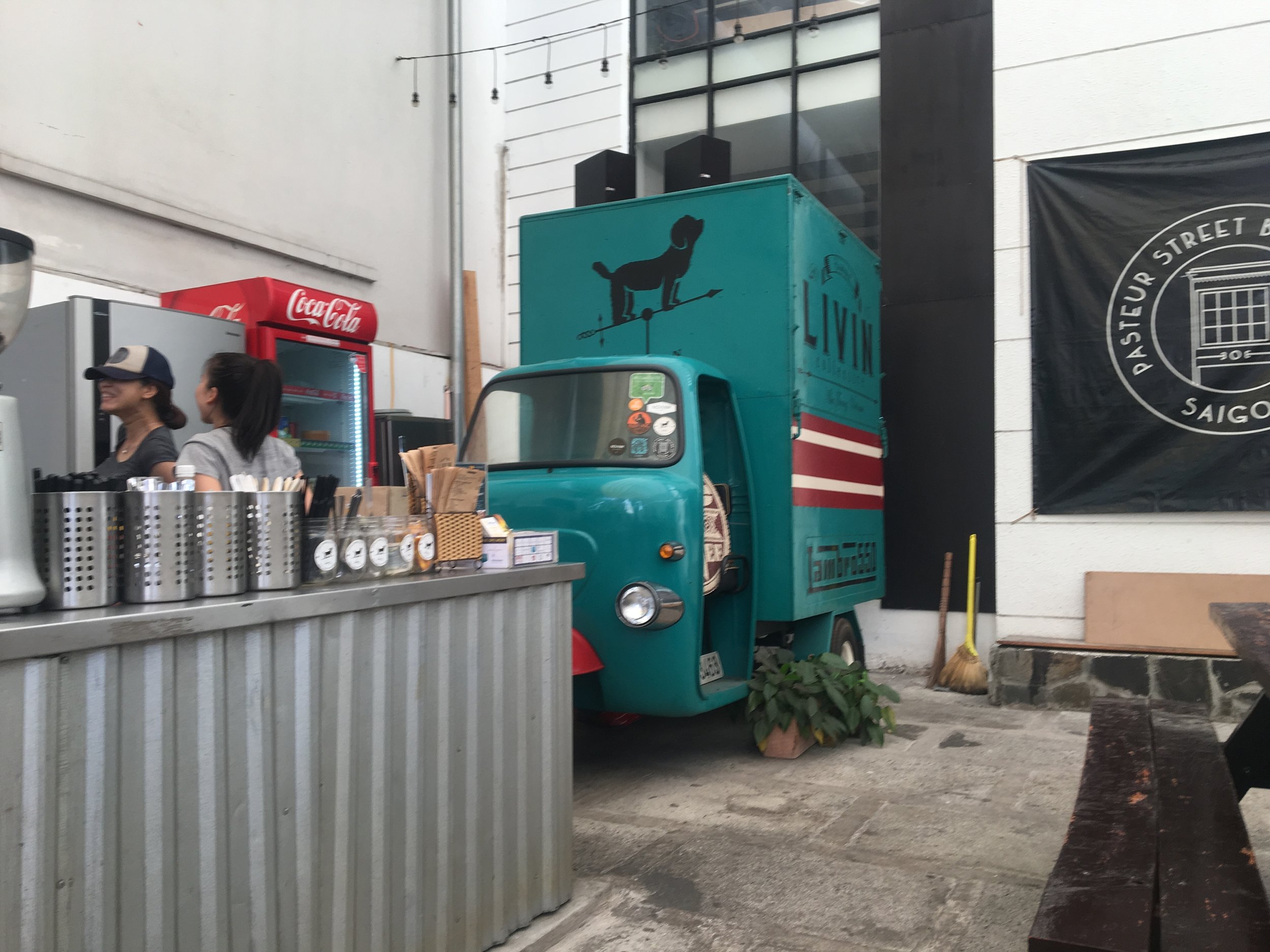
Coworking Space in Nha Trang, Vietnam - LIVINcollective
If you're looking for a coworking space in Nha Trang, go to LIVINcollective. It has fast wifi, incredible BBQ, and great people. Best of all, it's free to use the coworking space. Find them on Google Maps here.
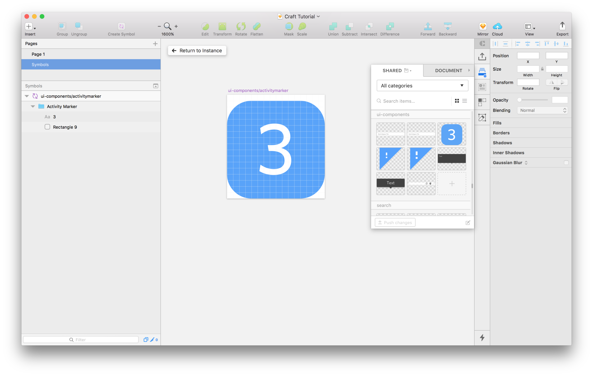
Quick Design Tutorial: Craft Library by inVision
Craft Library gives designers a single source of truth for symbols. This allows a team of designers to keep all their symbolized components in sync so everybody is working with the latest iteration on every component.
Read MoreHow to prevent passion projects from becoming black holes of time
I feel best when I have at least one passion project I'm working on. Right now I'm working on an iOS UI Kit that I'm really excited about. The challenge for me is that I can get really obsessive with these projects. I become like a...
Read More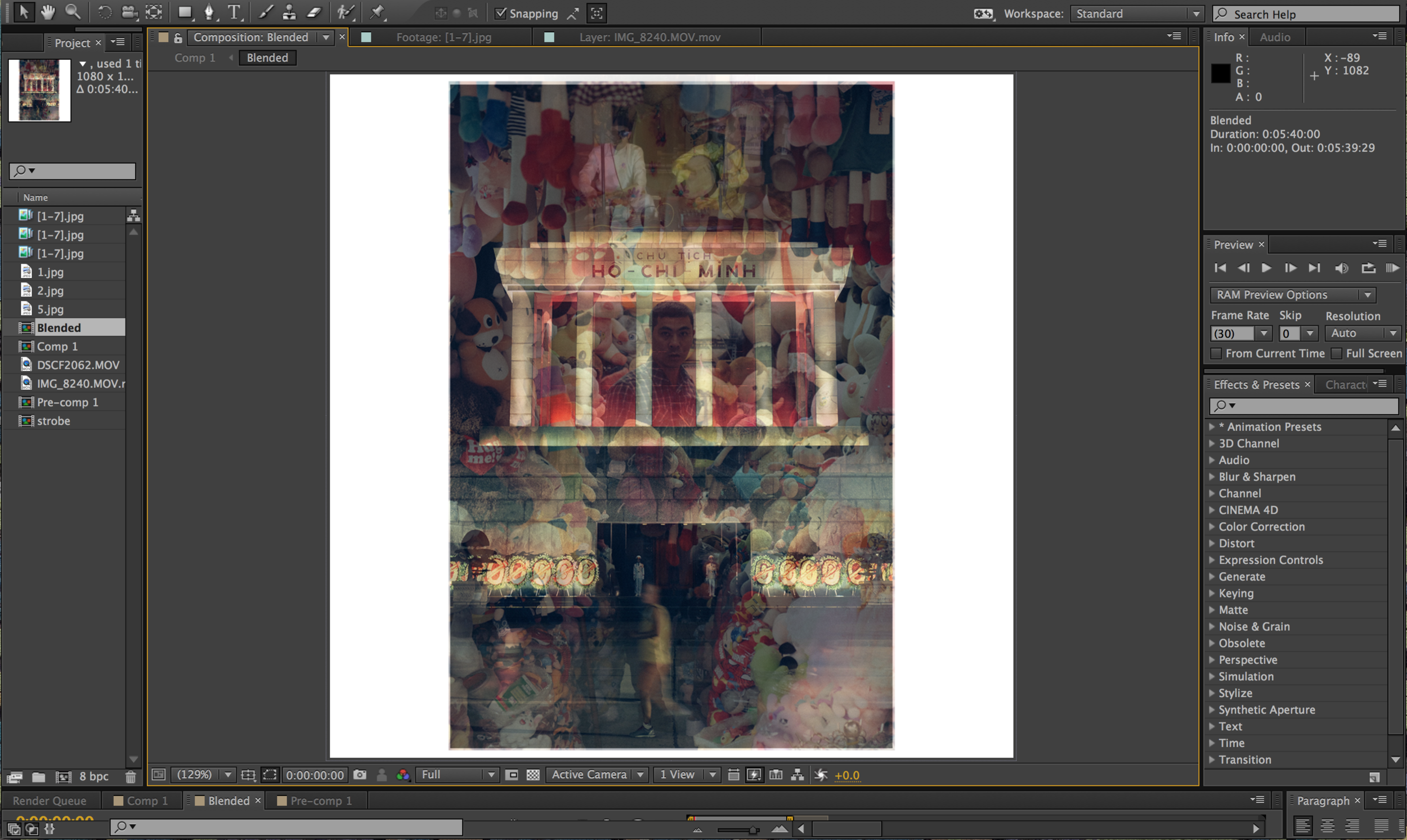
Experimenting in After Effects: Living Photos
Continuing to experiment with toeing the line between photos and videos, I decided to tinker around in After Effects. I used to spend a lot of time in AE when I was at Samsung, but it's been years since I've used it. It's such a great tool for expressing creativity since you have so much control, and motion/video is such a dynamic medium.
This time around, I wanted to make something that felt 99% like a still photo, but when looked at closely, has more facets than a simple photo.
When I arrived in Hanoi, I was struck by the chaos. I knew I wanted to capture imagery that spoke to that chaos. I usually strive for minimalist imagery that feels notably simple, with a singular focus. But I've been getting bored with that aesthetic in photography, and Hanoi was the perfect playground for developing a chaotic style.
Read MoreExperimenting with Video: Cat Ba Island / Chia Pet Infomercial Mashup. Embracing an erratic and unpolished style.
I'm continuing to experiment with moving images, trying to think in terms of snapshots with motion, as opposed to "video". In this 30-second piece, I wanted to play with a haphazard and erratic aesthetic.
Read More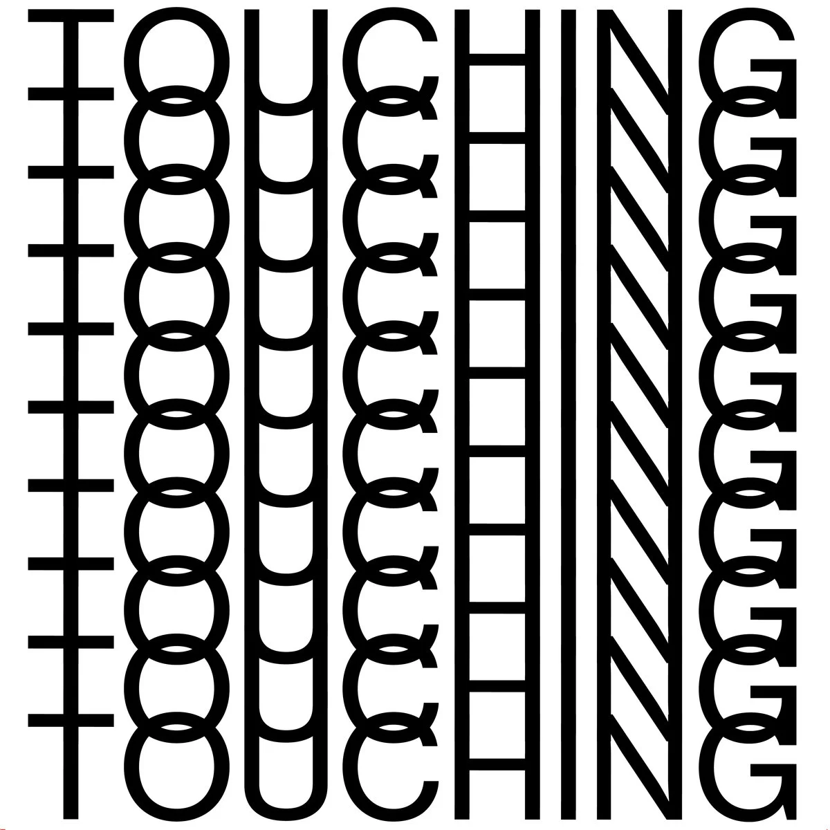
Cookies Album Cover - "Music For Touching"

Simple Tips For Great Mental Health That Will Set You Free
Developing great mental health is one of the most important personal responsibilities. It's no different that developing great physical health. You can learn techniques and best practices, and if you practice them with consistency, you get great results. Here are some things that have worked for me in creating a state of mind that is peaceful and allows for easy joy. Not only is there a general sense of ease in this state, but there is more room for creativity and ambition, because there's less fear and self-doubt to stand in the way.
Read More
13 Essential Tools for Freelance Designers
If you're a freelance designer, your time is your inventory, and the quality of your work determines your success. By introducing the right tools into your workflow you can both save time and improve the quality of your work. Here's my stack:
Read More
Experimenting with Video: A Day in Sapa, Vietnam
In any creative field it's important to expand our horizons and try new things. I've recently been playing around with video more as a natural extension of photography. Photo albums are a favorite format of mine because they allow for a loose story. Video builds on that, but adds motion.
I feel a common mistake people run into with video is dwelling too long on each shot. I wanted to maintain the snapshot element of photos, but with the added expressiveness and emotion that comes with moving images.
I try to limit each shot to 3 seconds or less in order to always keep the viewer's attention engaged and guessing.
This video was shot in one day in the beautiful valley of Sapa, Vietnam. It was a sunny day and I had a great time hiking along the rice paddies with my camera, meeting friendly people and taking in the stunning scenery.
Sapa is a really peaceful place and although people work hard in the rice paddies, there is a sense of joy in the air that I wanted to capture with this video.
I look forward to exploring video more as a format. I feel it's an area where my creative strengths can flourish. Photography obviously has a strong connection to videography, but I think the concepts I'm familiar with from design can be applied to video in interesting ways.
In design we have to always consider our work from the user's perspective. Taking this empathetic approach is great for video because we're designing someone's experience. We're trying to take them on a journey, the same way we do in UX design. Simplicity is also important in video, just as in design. By stripping away the unimportant, we can create a powerful focus on the important things.
So when I edit a video, I'm looking for one simple gesture or expression, and then cutting out everything before and after. This approach makes even the simplest gesture, or smile, and interesting moment.
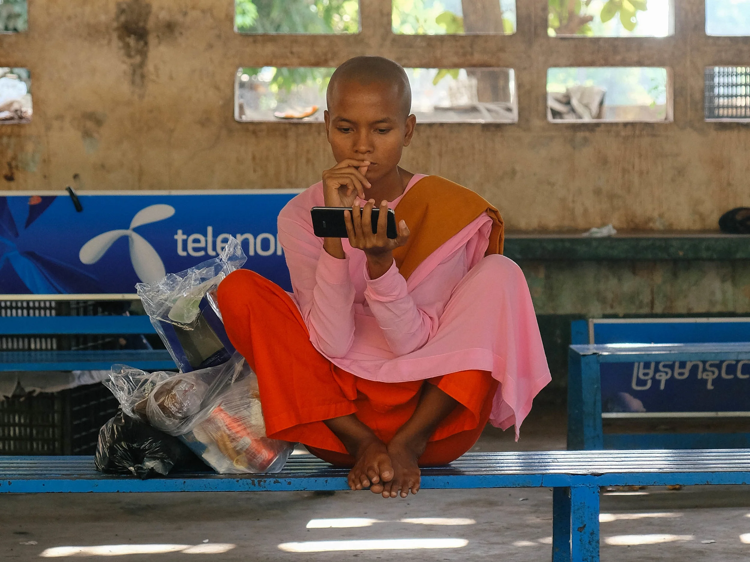
Behind the Camera: Photographing Myanmar
Myanmar is beautiful and fascinating country with friendly and welcoming people. It’s hard to beat Myanmar as a photography location. It’s stunning, and people are generally happy to have their photo taken
Read More
Information Architecture: The most important part of design you're probably overlooking
What is Information Architecture?
Simply put, Information Architecture is the structure of all the information in your app or website. When we put care into the arrangement of information, we can make it easier to understand and navigate. It’s similar to how a writer starts with an outline before they write a story, or how an architect starts with a blueprint before they choose they paint colors.
In essence, any digital product, website, or app is simply a collection of information. The practice of Information Architecture involves arranging this information in a way that is easy to understand, and can be scaled as the app or website grows (as you add features, for example).
An app or website that has good Information Architecture is structurally sound. It's very much like a building. If we're deliberate about what the important pillars are, and we start there, we have a solid foundation. When we have a solid foundation, we can continue to build without things getting too shaky.
Example
Let’s take Spotify as an example. We can deconstruct the UI to reveal the underlying Information Architecture.

Why Is Information Architecture Important?
If you want clean and focused design, you have to start with clean and focused Information Architecture. This approach forces us to do the thinking, so our users don’t have to. When we think about the Information Architecture of an app, we're forced to view it - not as a collection of pages and pixels - but rather as a collection of abstract thoughts: nouns and verbs. Nothing more.
We quickly see that an app or website is just information. The way we piece that information together determines how well it will be received.
It's just like constructing a thought, or sentence, or idea. The arrangement of the nouns and verbs in the sentence will determine how well the message is received.
An app is the same thing. An app is just a collection of nouns and verbs: “stuff” and “actions I can take on the stuff”. The nouns are the really important things. They make up the world of your app. The nouns in your app can be things like:
- Songs
- Folders
- Users
- Photos
- Restaurants
- Money
- Friends
This is the stuff that makes up your app.
The verbs are the actions the user can take on those nouns. Here are some examples:
- Play a song
- Create a folder
- Create a user
- Share a photo
- Find a restaurant
- Send money
- Add friends
So typically, in an app we can follow a certain pattern. A majority of the screen (roughly 80%) is devoted to displaying the "nouns", and a smaller portion is devoted to displaying the "verbs" - the available actions that the user can take on those nouns.
Good information architecture is universal (AND TIMELESS)
Over time we see that good information architecture is universal. Certain principles and patterns seem to always prevail. Perhaps most obviously, the items in the top-most navigation of your app should be the most important things. For Spotify, those things are “Home”, “Browse”, “Search”, “Radio”, and “Your Library”. What are the most important things in your app? Try to limit it to 3-5 items.
Where things get interesting is when we realize that information wants to take on similar structures, regardless of the exact nature of the information. For example, a common pattern we see is that as we navigate deeper into the Information Architecture of an app, we tend to move from broad collections of items, toward specific items. This is often referred to as “drilling down”.
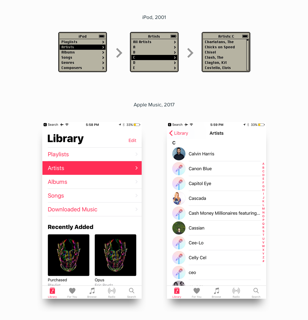
Patterns Emerge
Once we’ve designed enough apps, websites, and digital products - we start to realize that these structures of Information are really all the same on some level. It’s just the names of the information that changes. A good designer knows how to start with one of these tried and true structures. These structures, at their essence, are agnostic to the information they contain.
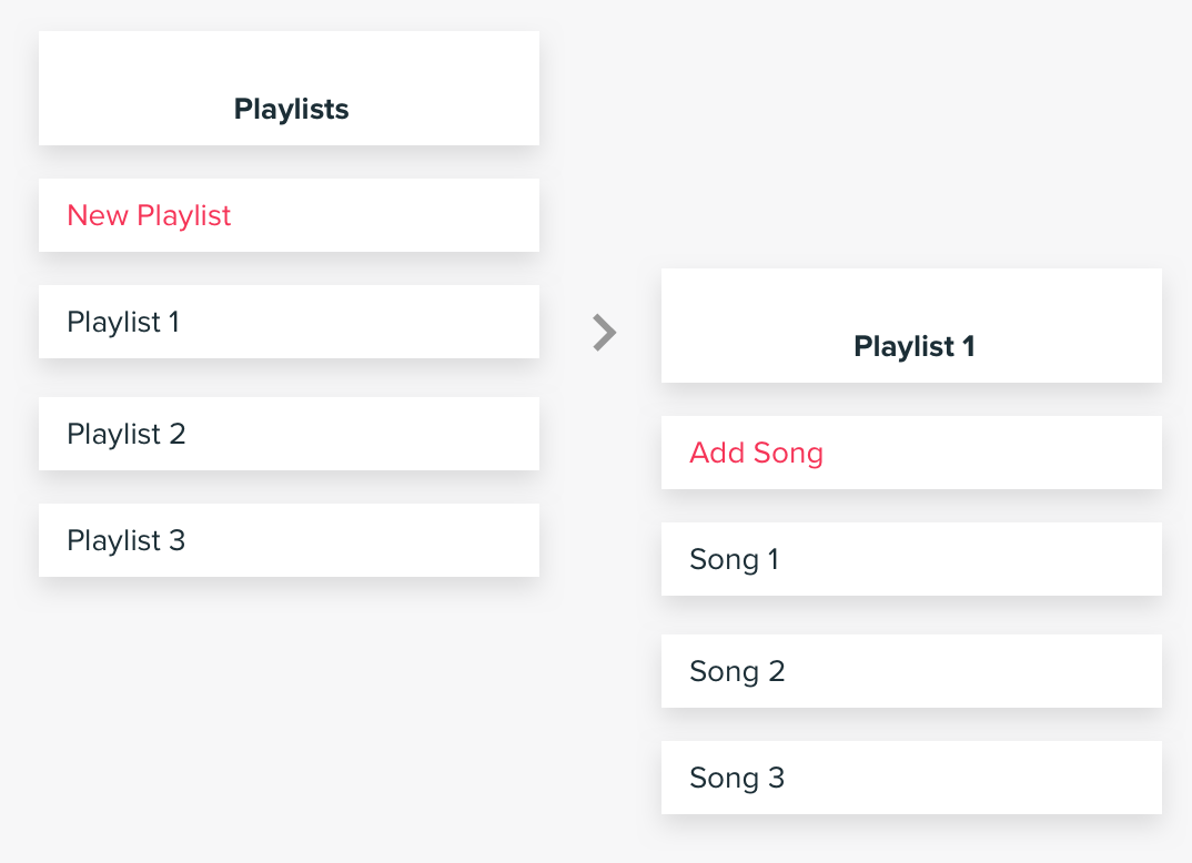
Music is the same as...
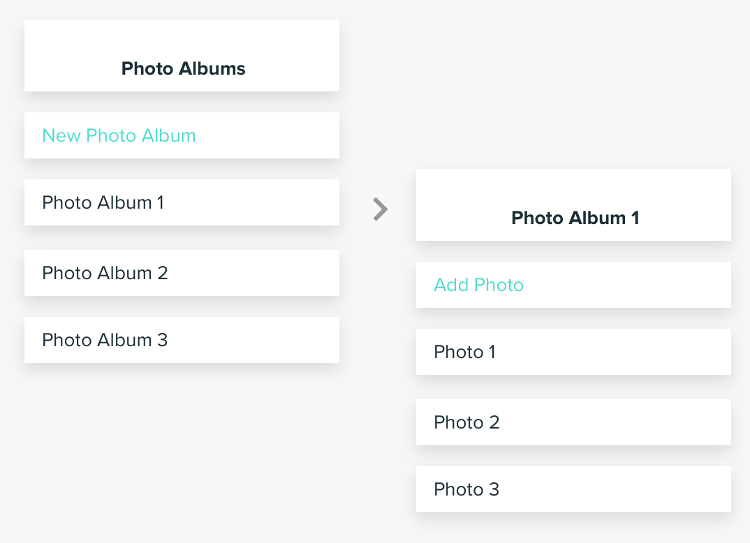
Photos, which are the same as...
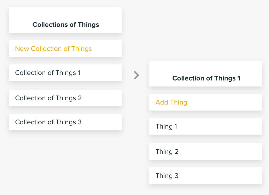
Things, which are the same as...
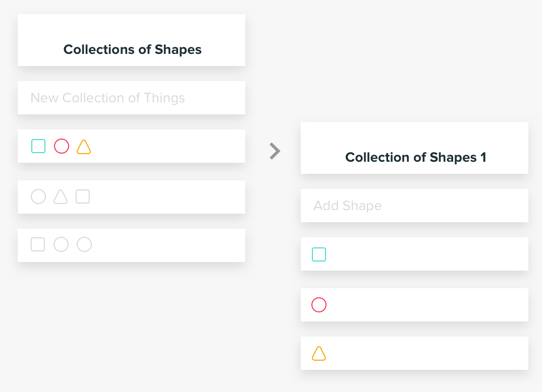
Shapes, which are the same as.... You get the point.
It's all the same thing!
So we start with these agnostic structures. Then, as we start to “pour” information into these containers, we can start to customize the presentation to speak to the unique nature of the information contained within them. For example, information that is more visual, like Photos, will be presented differently than information that is more data-based, like Credit Card Transactions.
Tips for creating good, clean information architecture
1. Be very clear about what the most important things in your app are
Don’t be afraid to minimize the importance of some things, this is necessary to maximize the importance of others. Contrast is critical in providing clarity. Get rid of information where you can, and minimize it when you can’t.
2. Think in terms of "Buckets" of information
Think about which things belong together. For example, a Profile section of your app is likely a good place to contain everything related to the user, rather than scattering them around the app.
3. Don't be afraid to revisit your information architecture
Make sure to revisit your Information Architecture as your app or website evolves and grows. Teams often neglect to maintain their Information Architecture because they think it’s all-or-nothing: “we’d love to clean up our Information Architecture but we don’t have the resources to redesign the whole app.” Think in more incremental terms. There are probably a few things you could do easily to improve the structure of information in your product (and thereby improve the usability).