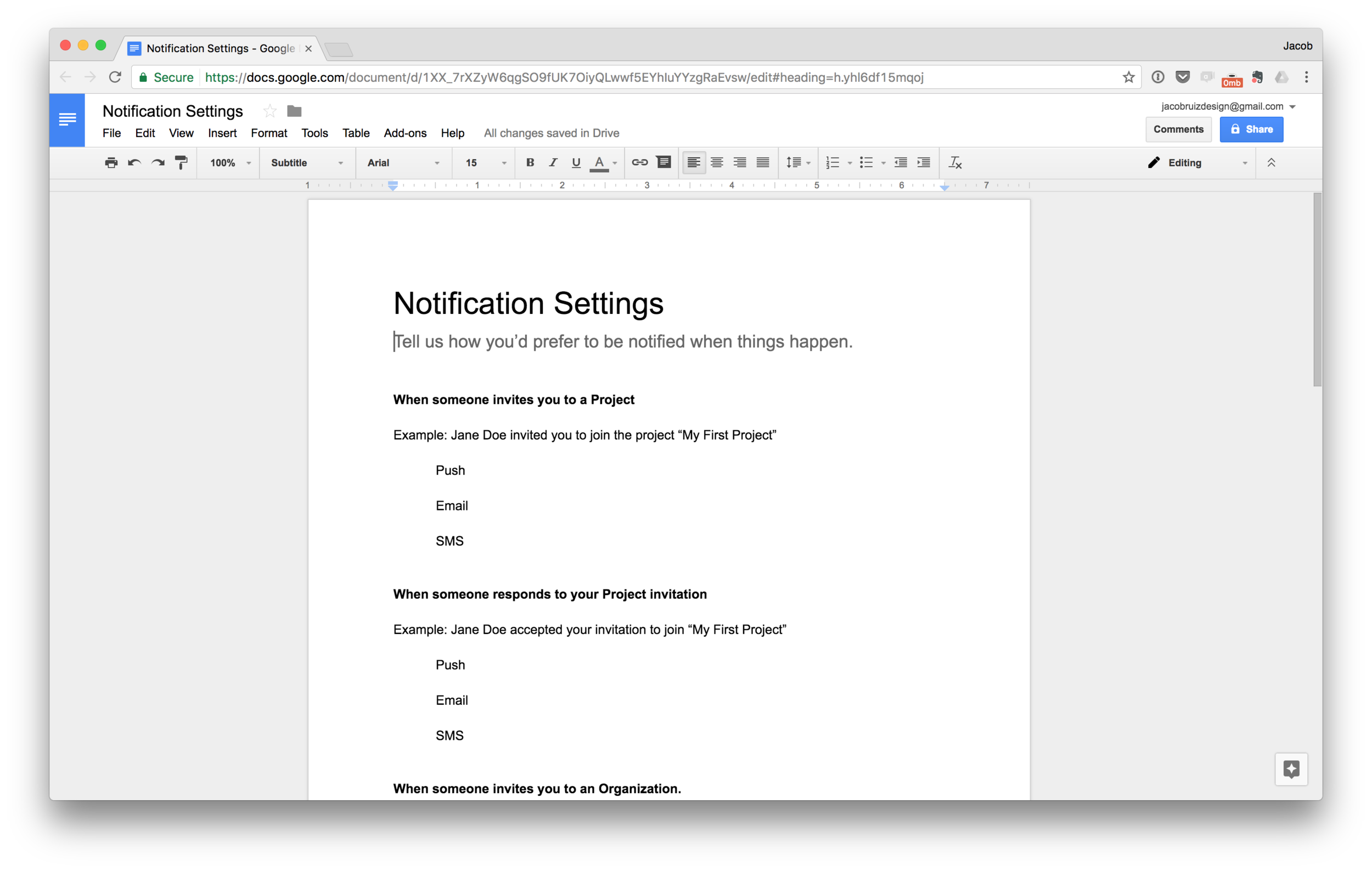
Designers need to constantly fight the urge to get caught up in visual design, and instead focus on content and structure. One technique I'd recommend trying in order to focus on content is designing in Google Docs. It might sound boring and pedestrian, but it's extremely effective in focusing your thinking on the content and structure of a page, without getting bogged down in pixels.
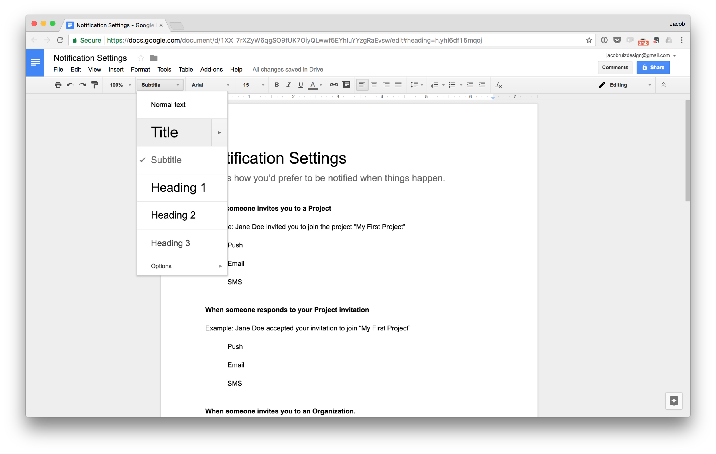
Use the predefined text settings as an analog for text styles in Sketch.
Get all your content in the page without overthinking things, and then start editing and restructuring for maximum clarity.
You'll quickly arrive at a content structure that makes sense, since you can iterate quickly in Google Docs.
Now you have a refined content structure that you can reproduce in Sketch, this time you can feel free to focus on applying your visual style in a way that enhances the already clear content.

