Squarespace is a powerful platform for building websites quickly with themes that are well-designed from the start. Once you have your site up and running, you'll find yourself wanting to customize certain things to make your website unique.
In this tutorial, I'll show you how to customize the buttons in your Squarespace site by adding an animated hover-state effect. This hover state will invert the colors of the button and add a trendy diffused drop shadow underneath the button to give a sense of depth - as if the button is floating above the page behind it.
If you're in a hurry and just want to copy and paste my CSS into your site, here you go:
.small-button-style-solid .sqs-block-button .sqs-block-button-element--small, .medium-button-style-solid .sqs-block-button .sqs-block-button-element--medium, .large-button-style-solid .sqs-block-button .sqs-block-button-element--large {
    transition: all 250ms cubic-bezier(.02, .01, .47, 1);
    transition-property: all;
    transition-duration: 200ms;
    transition-timing-function: cubic-bezier(0.02, 0.01, 0.47, 1);
    transition-delay: initial;
      border-radius: 5px;

}

.small-button-style-solid .sqs-block-button .sqs-block-button-element--small:hover, .medium-button-style-solid .sqs-block-button .sqs-block-button-element--medium:hover, .large-button-style-solid .sqs-block-button .sqs-block-button-element--large:hover {
  opacity: 1;
  background-color: white;
  color: black;
  box-shadow: 0 10px 30px rgba(0,0,0,.14)
}
Simply paste this code into the Custom CSS section in the Squarespace menu, and you'll be done.
If you have time for a step-by-step tutorial, I'd recommend following the full tutorial below.
I've broken the process into easy-to-follow mini-steps. Following these steps will teach you the skills you'll need to play with your own customizations in the future. Each step has an animated GIF to go with it so you can see it in action.
Let's get started:
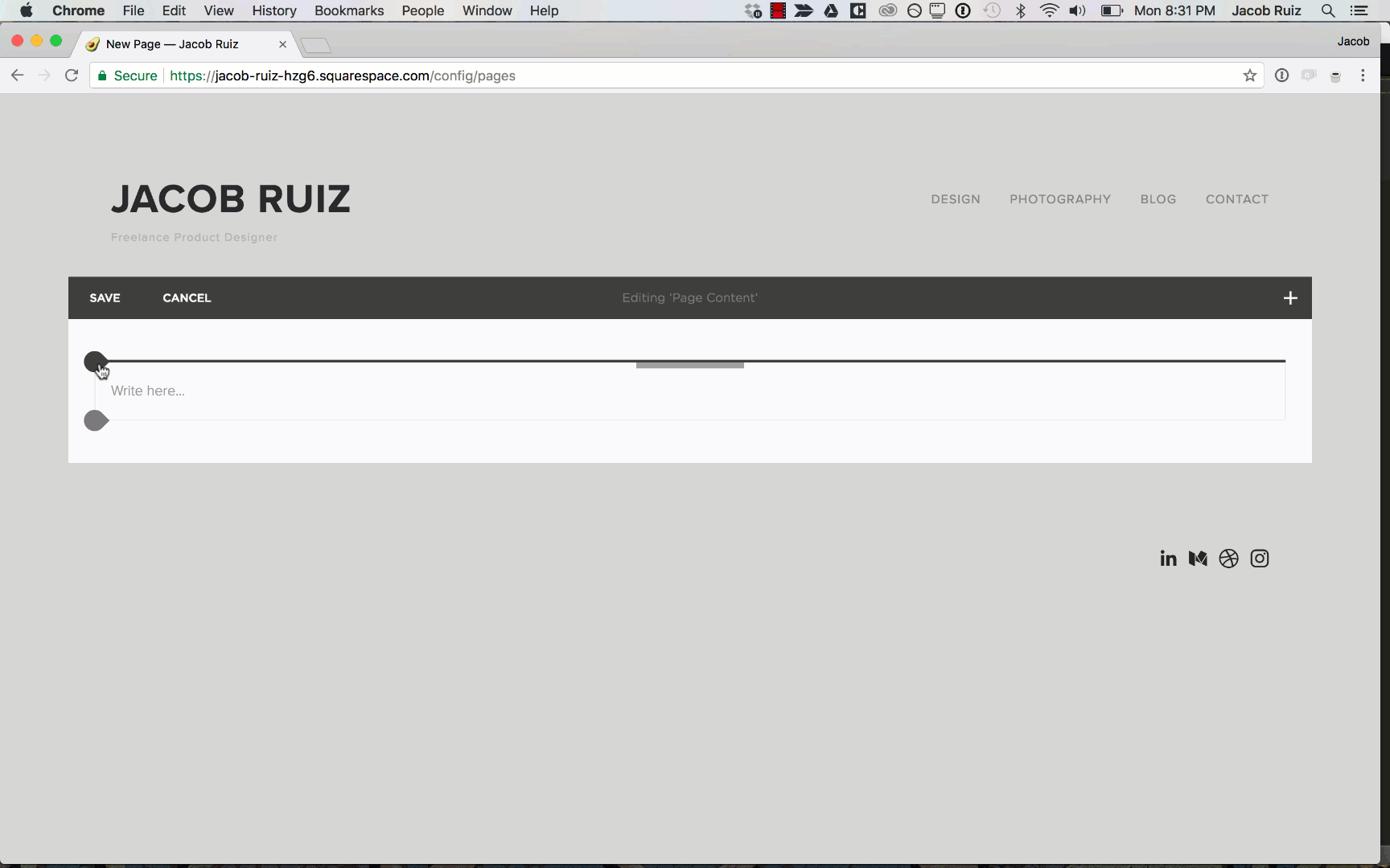
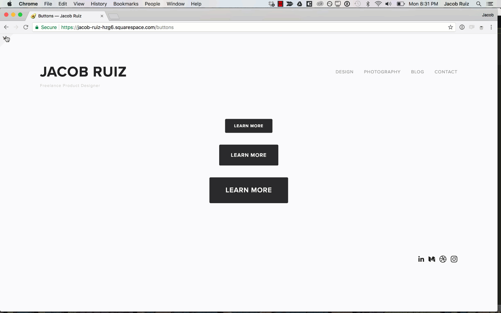
Create a new blank page in Squarespace.
Creating a new blank page in Squarespace.
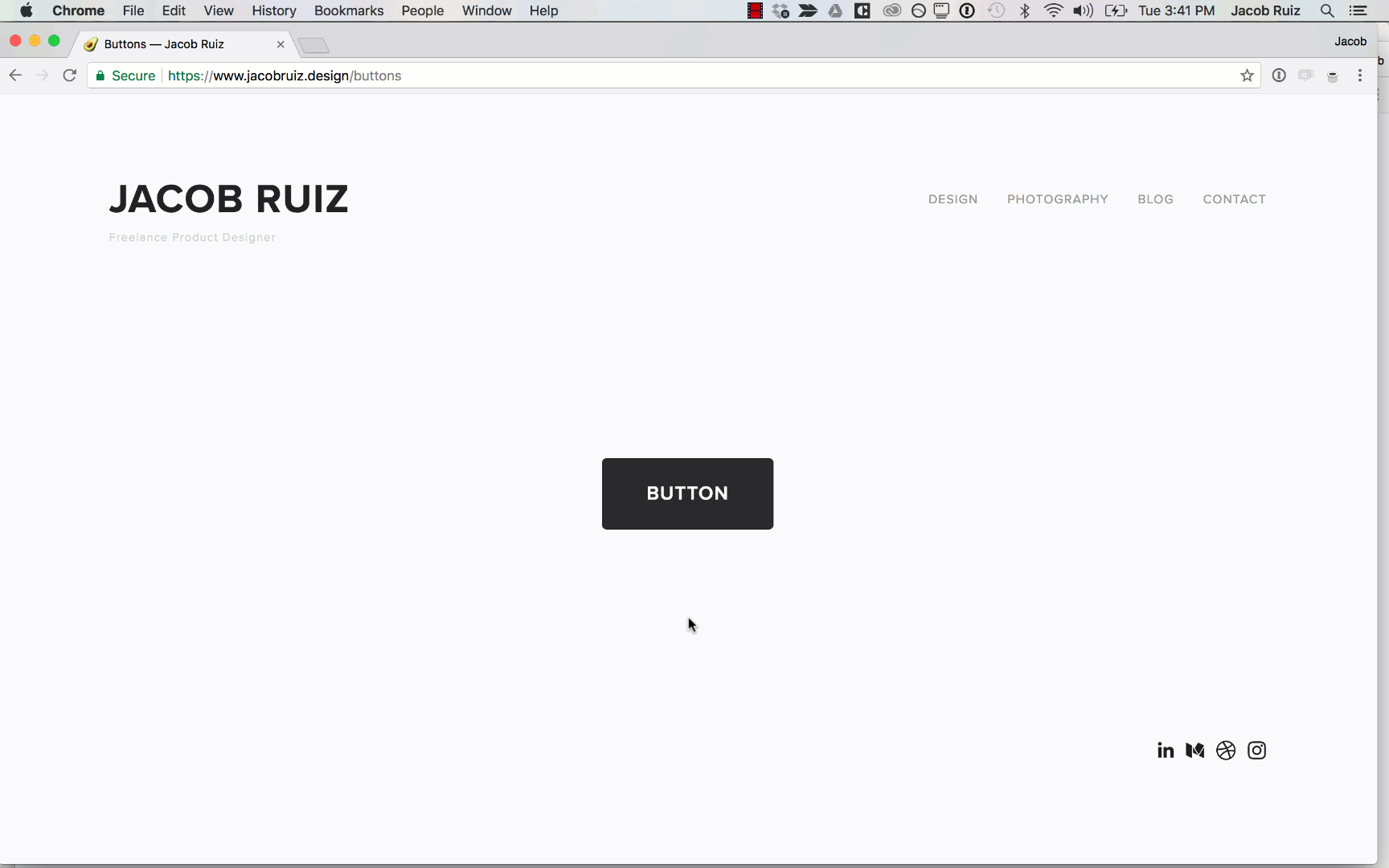
Add a button of each size: small, medium, and large.
Adding a small, medium, and large button to your blank page in Squarespace.
Note the current hover state of these buttons.
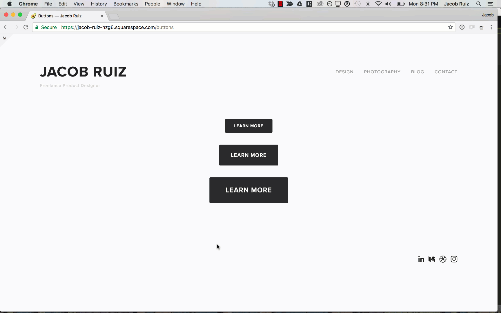
Testing the current hover state.
In the Squarespace theme from this example, hovering the mouse over the buttons drops the opacity of the button to 0.8. We're going to change this to something more interesting and fluid.
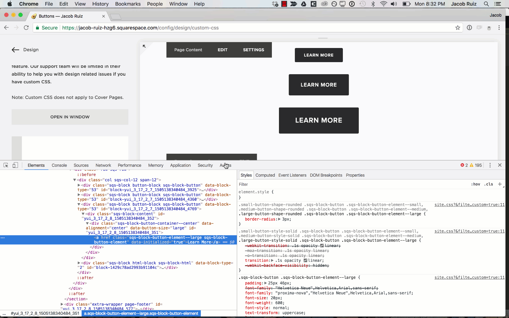
Use the Squarespace menu to navigate to Design > Custom CSS.
In Chrome, right click one of the buttons and choose "Inspect".

Copy the CSS for the buttons (from the Chrome panel) and paste it into the Custom CSS box in the Squarespace panel.
The CSS may vary by theme, but in this example the CSS is:
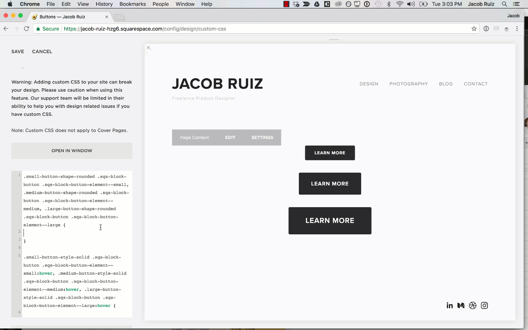
.small-button-shape-rounded .sqs-block-button .sqs-block-button-element--small, .medium-button-shape-rounded .sqs-block-button .sqs-block-button-element--medium, .large-button-shape-rounded .sqs-block-button .sqs-block-button-element--large {
    border-radius: 3px;
}
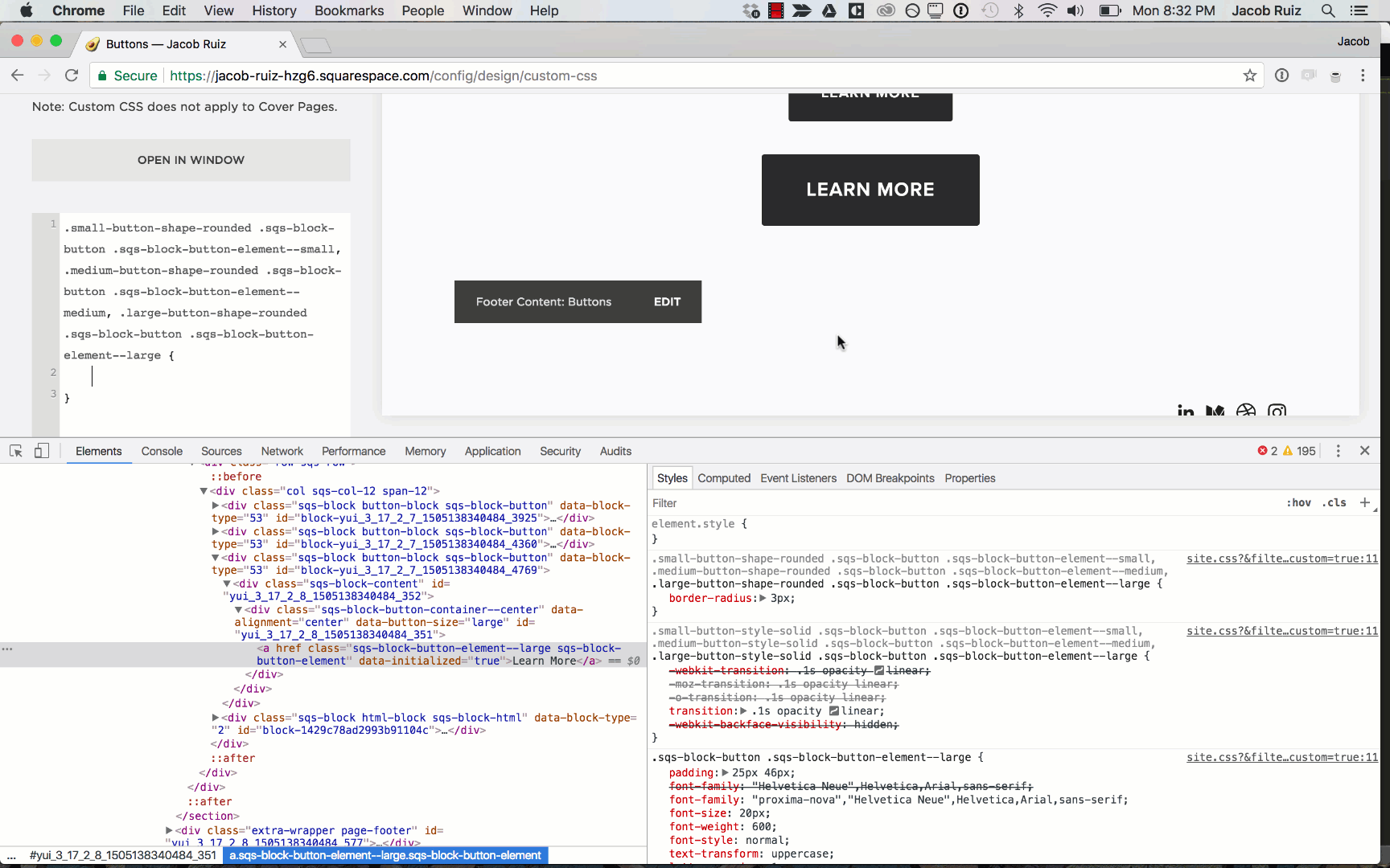
You can delete the property:
border-radius: 3px;
(We'll be adding our own properties in it's place shortly.)
Now we have the CSS for the default state of the button, ready for customization.
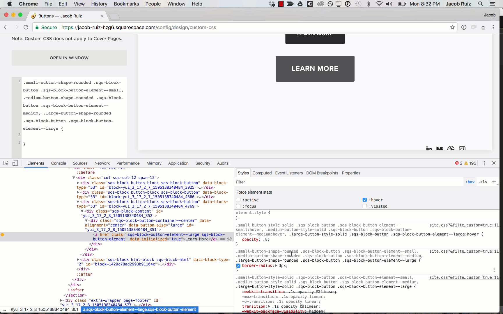
Next, we need the CSS for the hover state of the button.
In the Chrome panel, click the ":hov" tab to reveal the other states. of the button and check ":hover".
Copy the CSS for the hover state from the Chrome panel, and paste it into the Custom CSS box in the Squarespace panel.
You can delete the property:
opacity: 0.8;
(Again, we'll be adding our own properties instead.)
Now with these two blocks of CSS, you have isolated the CSS selectors for all 3 button sizes in both default and hover states, allowing you to add custom properties to each.
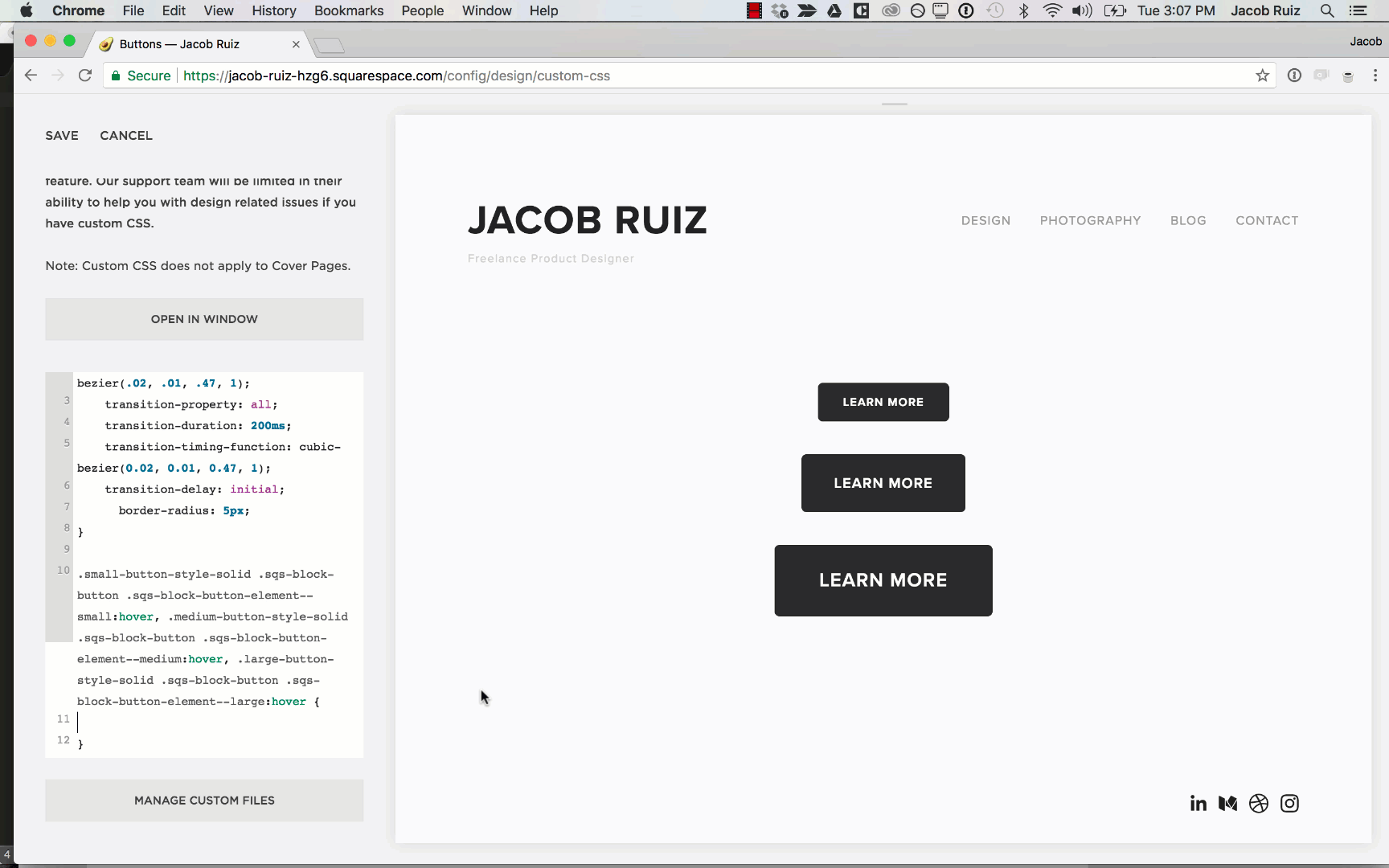
In the Custom CSS box in the Squarespace panel add the following properties to the default state of the button (the first block of CSS, the one without ":hover" in it.):
    transition: all 250ms cubic-bezier(.02, .01, .47, 1);
    transition-property: all;
    transition-duration: 200ms;
    transition-timing-function: cubic-bezier(0.02, 0.01, 0.47, 1);
    transition-delay: initial;
    border-radius: 5px;
This does a few things:
- Defines the transition between the default state and hover state.
- Customizes the border-radius of the button.
Adding new properties to the default state of the buttons.
Next, we'll customize the hover state of the button.
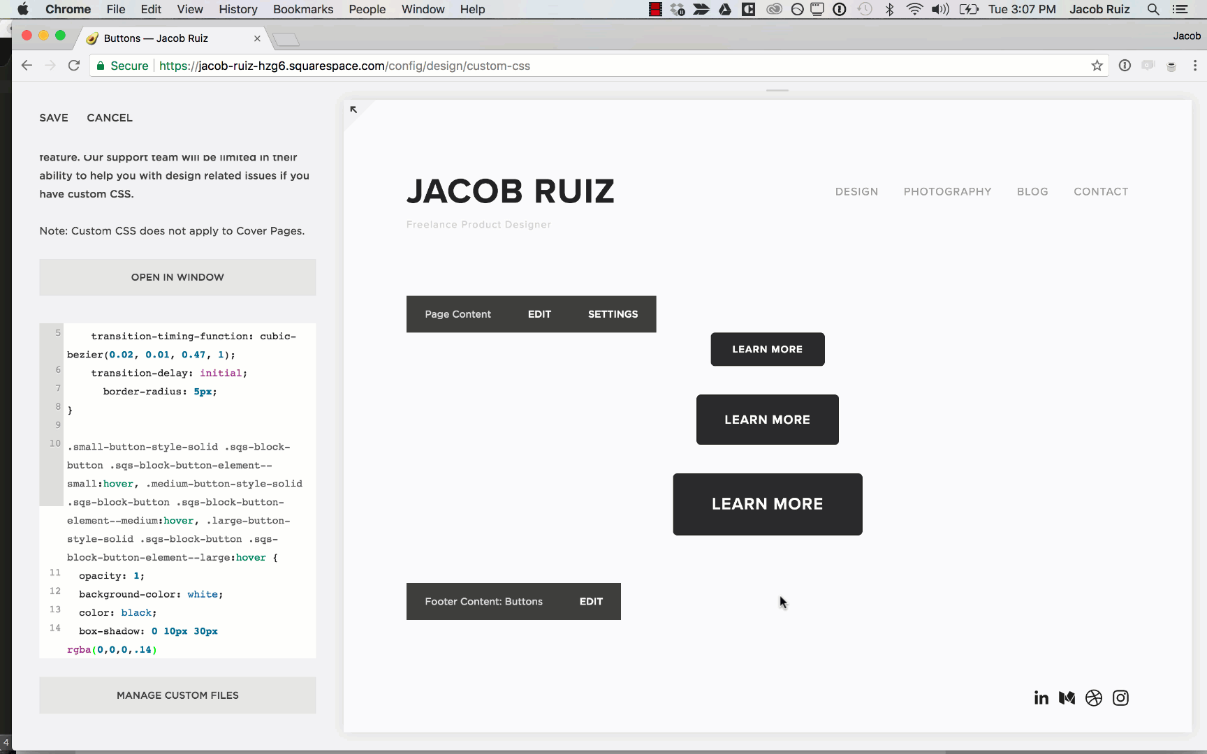
In the same Custom CSS box, add the following properties to the hover state of the button. (The second block of CSS, the one that has ":hover" in it.).
  opacity: 1;
  background-color: white;
  color: black;
  box-shadow: 0 10px 30px rgba(0,0,0,.14)
This does a few things:
- Keeps the full opacity of the button (instead of the transparent effect that was there by default.)
- Changes to background-color of the button to white when the user hovers over it.
- Changes the text color to black during the hover state. When combined with the line above, it creates the inverted effect we're going for.
- Adds a box-shadow (a.k.a. drop shadow) to the button on hover. The high blur value of 30px gives us a nice subtle diffused shadow, made even more subtle by the opacity value of .14)
Adding the new hover state properties.
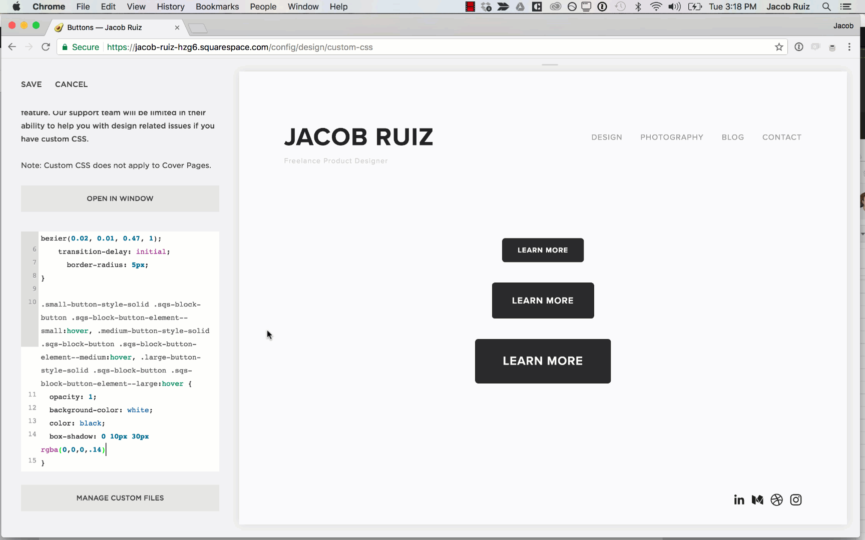
Now the buttons have their new custom CSS applied.
Hover over the buttons with your mouse to test the new effect.
Look at those sexy new buttons!
In the Squarespace panel, with the Custom CSS section still open, click "Save" to apply the changes.
Now all the buttons on your site will have a cool new diffused shadow effect on hover.
That's it!
I'd love your feedback. Feel free to fill out the form below with any feedback you have. I'd love to hear from you about:
- What did you like about this tutorial?
- What could be better about this tutorial?
- What tutorials would you like to see in the future?