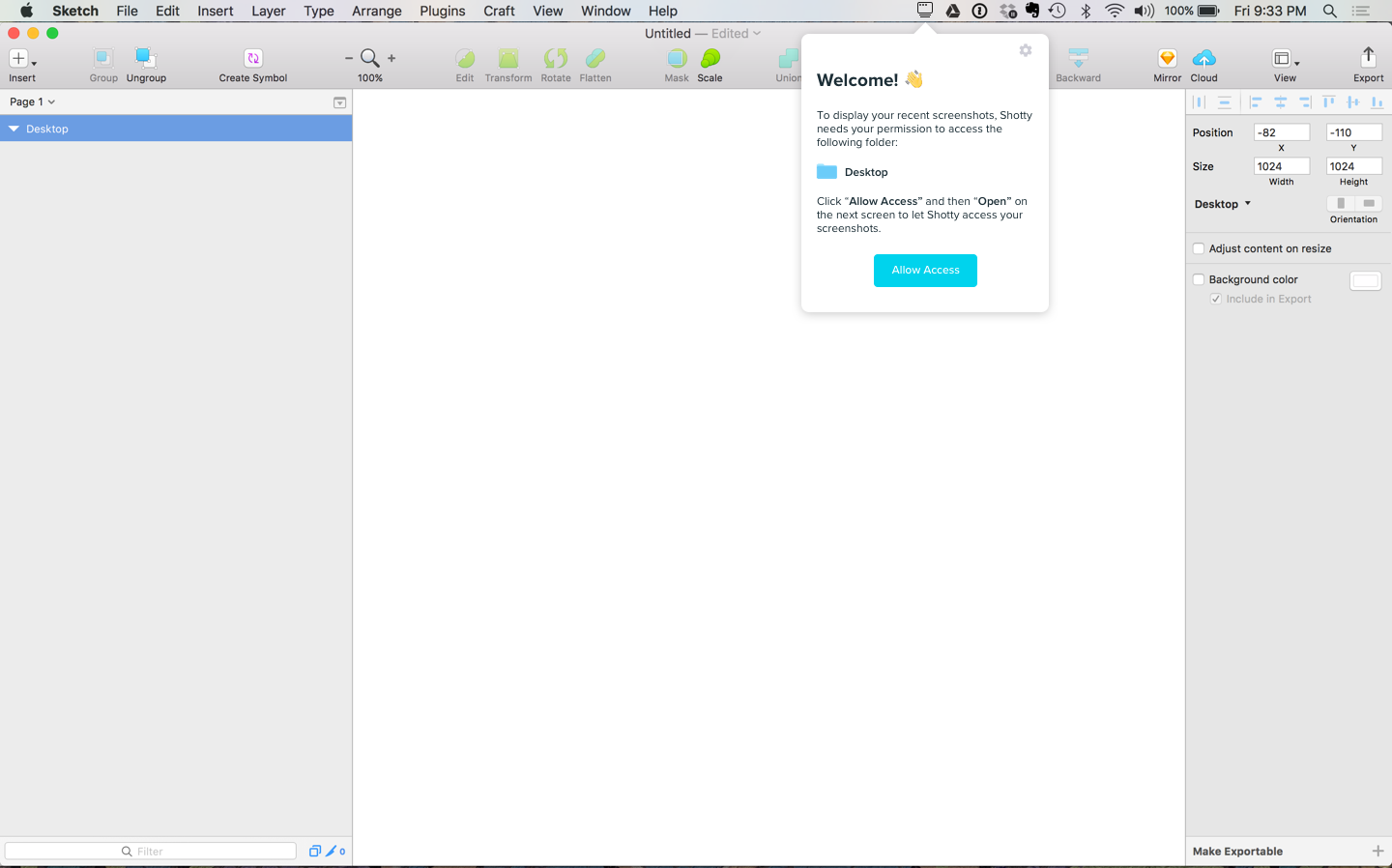
User onboarding is an art and science that deserves a lot of attention and care. First impressions can make or break your relationship with your user, and as a designer it's your responsibility to be a gracious host to everyone who walks through the door.
A few guiding principles:
Move users to their first "moment of success" as quickly as possible.
Decide what moment in your user experience stands out as a moment of success. For example, one of the first moments of success for a new user on Facebook would be adding their first friend.
This moment of success is where you need to guide your user to. Do this as quickly and pleasantly as possible.
Teach users both WHY to use your product and HOW.
Assume a new user is about 50% sold on why they should use your product. They're giving it a try, so they must be at least partially convinced, but onboarding is a great time to seal the deal and show the user why they need your product in their life.
Once they're convinced about the "why", they need to know how to use your product. Of course the user interface should be as intuitive as possible, so as to require as little explanation as possible - but a little guidance can go a long way in helping people orient themselves in your product. Do some user testing to identify places where people get stuck in the user experience, and to identify ways you can reduce confusion.
Convey the personality of your brand and product
Just like the lobby in a hotel conveys the general vibe of the hotel, your user onboarding experience will inevitably convey the personality of your product. Think about how you want your users to feel, and use language and visuals that evoke that feeling.
- Don't be boring
- Be friendly
- Establish trust
- Get to the point
For example, in Shotty, the app needs permission from the user to access the folder where their screenshots are stored. This could be done in a very transactional and functional way, but instead, we used it as an opportunity to do a few key things:
- Welcome our users into the app and be friendly
- Describe the end benefit ("To display your recent screenshots") that will result from taking this action
- Give a single, clear call-to-action.
Talk to your users and refine the experience over time.
By consciously designing an effective and enjoyable onboarding experience, you'll be making a massive improvement to your product. But you won't get it perfect the first time. Be sure to revisit this crucial part of the user experience from time to time with the goal of making it even better. Think of yourself as filing away friction points that are snagging people on the way in. Go through the experience yourself. Watch other people go through the experience. Ask lots of questions.
Investing in this part of the user experience is always worth it because not only does this impact every user the first time they use the product, but it also shapes their perception of your product and brand long-term.
If you'd like to see a detailed analysis of some of the best onboarding experiences, head over to useronboard.com to see how companies like Slack, Snapchat, Instagram, Pinterest, and others have designed their user onboarding experiences.
