
What is Information Architecture?
Simply put, Information Architecture is the structure of all the information in your app or website. When we put care into the arrangement of information, we can make it easier to understand and navigate. It’s similar to how a writer starts with an outline before they write a story, or how an architect starts with a blueprint before they choose they paint colors.
In essence, any digital product, website, or app is simply a collection of information. The practice of Information Architecture involves arranging this information in a way that is easy to understand, and can be scaled as the app or website grows (as you add features, for example).
An app or website that has good Information Architecture is structurally sound. It's very much like a building. If we're deliberate about what the important pillars are, and we start there, we have a solid foundation. When we have a solid foundation, we can continue to build without things getting too shaky.
Example
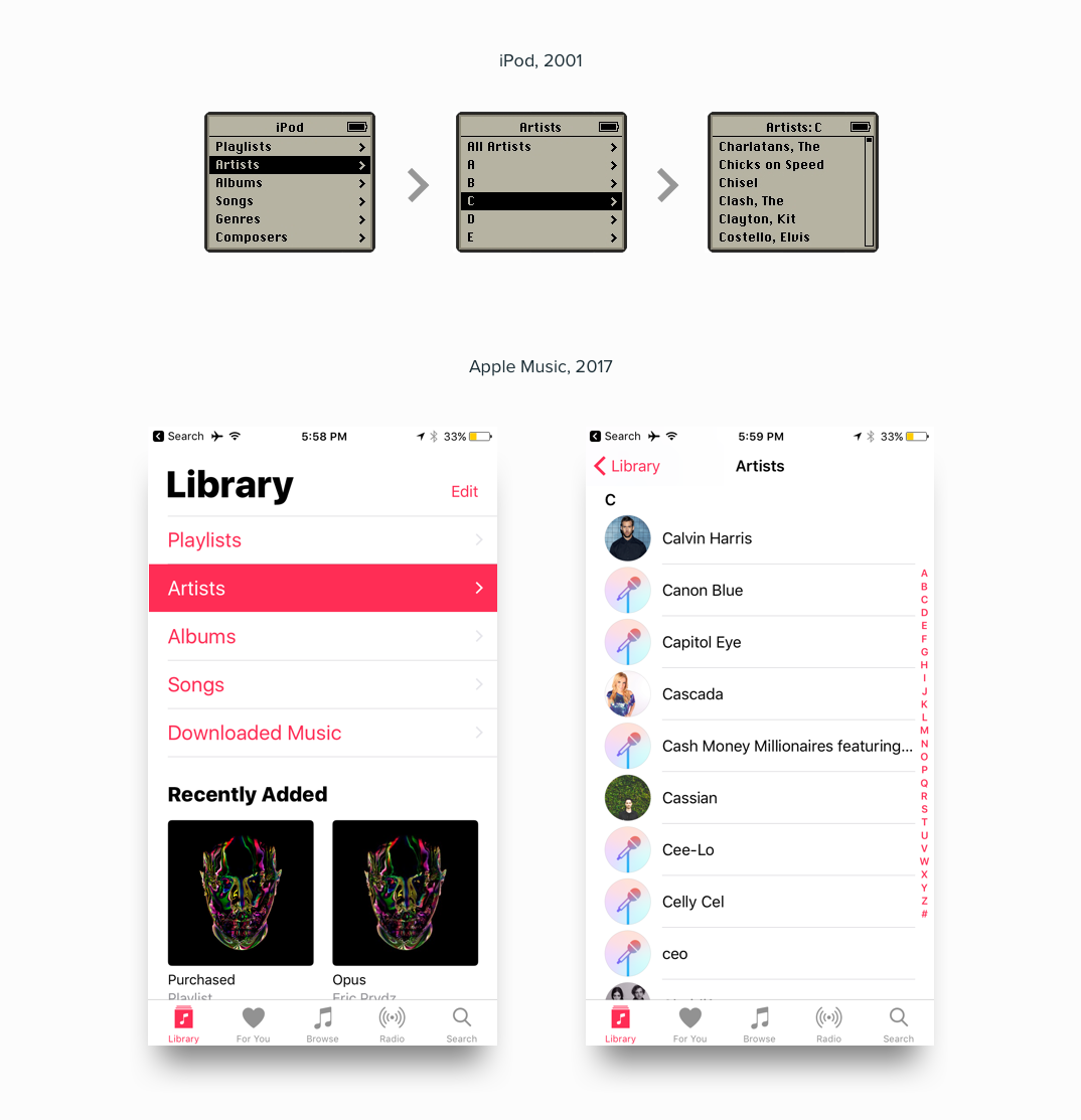
Let’s take Spotify as an example. We can deconstruct the UI to reveal the underlying Information Architecture.

Why Is Information Architecture Important?
If you want clean and focused design, you have to start with clean and focused Information Architecture. This approach forces us to do the thinking, so our users don’t have to. When we think about the Information Architecture of an app, we're forced to view it - not as a collection of pages and pixels - but rather as a collection of abstract thoughts: nouns and verbs. Nothing more.
We quickly see that an app or website is just information. The way we piece that information together determines how well it will be received.
It's just like constructing a thought, or sentence, or idea. The arrangement of the nouns and verbs in the sentence will determine how well the message is received.
An app is the same thing. An app is just a collection of nouns and verbs: “stuff” and “actions I can take on the stuff”. The nouns are the really important things. They make up the world of your app. The nouns in your app can be things like:
- Songs
- Folders
- Users
- Photos
- Restaurants
- Money
- Friends
This is the stuff that makes up your app.
The verbs are the actions the user can take on those nouns. Here are some examples:
- Play a song
- Create a folder
- Create a user
- Share a photo
- Find a restaurant
- Send money
- Add friends
So typically, in an app we can follow a certain pattern. A majority of the screen (roughly 80%) is devoted to displaying the "nouns", and a smaller portion is devoted to displaying the "verbs" - the available actions that the user can take on those nouns.
Good information architecture is universal (AND TIMELESS)
Over time we see that good information architecture is universal. Certain principles and patterns seem to always prevail. Perhaps most obviously, the items in the top-most navigation of your app should be the most important things. For Spotify, those things are “Home”, “Browse”, “Search”, “Radio”, and “Your Library”. What are the most important things in your app? Try to limit it to 3-5 items.
Where things get interesting is when we realize that information wants to take on similar structures, regardless of the exact nature of the information. For example, a common pattern we see is that as we navigate deeper into the Information Architecture of an app, we tend to move from broad collections of items, toward specific items. This is often referred to as “drilling down”.
Patterns Emerge
Once we’ve designed enough apps, websites, and digital products - we start to realize that these structures of Information are really all the same on some level. It’s just the names of the information that changes. A good designer knows how to start with one of these tried and true structures. These structures, at their essence, are agnostic to the information they contain.
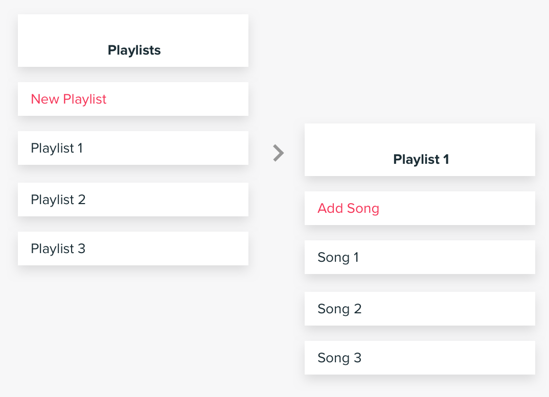
Music is the same as...
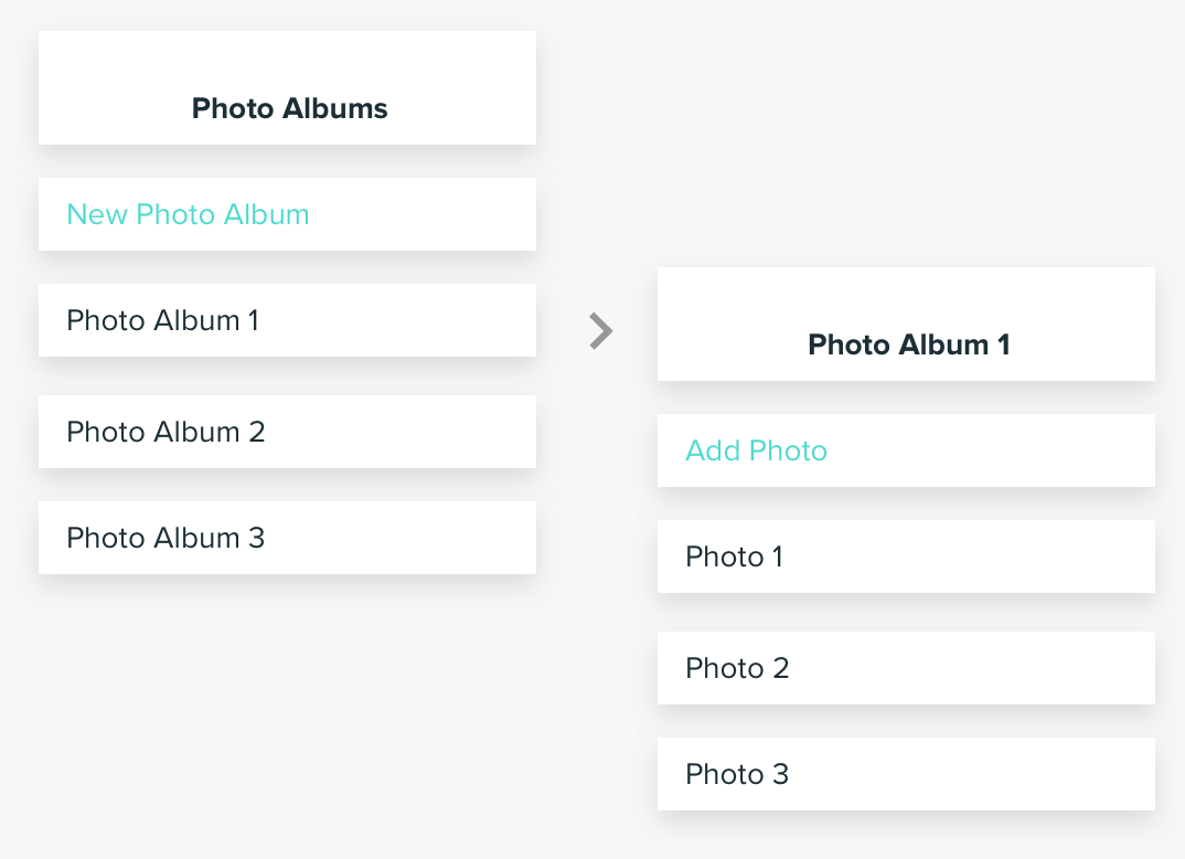
Photos, which are the same as...
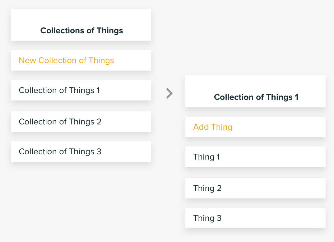
Things, which are the same as...
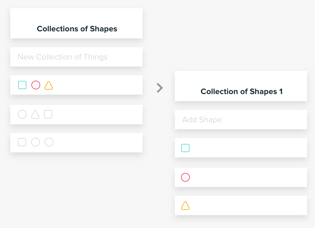
Shapes, which are the same as.... You get the point.
It's all the same thing!
So we start with these agnostic structures. Then, as we start to “pour” information into these containers, we can start to customize the presentation to speak to the unique nature of the information contained within them. For example, information that is more visual, like Photos, will be presented differently than information that is more data-based, like Credit Card Transactions.
Tips for creating good, clean information architecture
1. Be very clear about what the most important things in your app are
Don’t be afraid to minimize the importance of some things, this is necessary to maximize the importance of others. Contrast is critical in providing clarity. Get rid of information where you can, and minimize it when you can’t.
2. Think in terms of "Buckets" of information
Think about which things belong together. For example, a Profile section of your app is likely a good place to contain everything related to the user, rather than scattering them around the app.
3. Don't be afraid to revisit your information architecture
Make sure to revisit your Information Architecture as your app or website evolves and grows. Teams often neglect to maintain their Information Architecture because they think it’s all-or-nothing: “we’d love to clean up our Information Architecture but we don’t have the resources to redesign the whole app.” Think in more incremental terms. There are probably a few things you could do easily to improve the structure of information in your product (and thereby improve the usability).